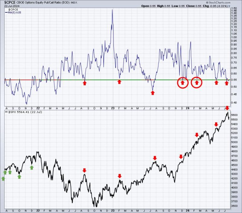
Chart #1: Moving Averages
The first chart to keep an eye on is the moving averages. Moving averages are a fundamental technical analysis tool that helps to smooth out price data by creating a single flowing line. Two types of moving averages are commonly used: the simple moving average (SMA) and the exponential moving average (EMA). Traders often look at the 50-day and 200-day moving averages to identify trends and potential areas of support and resistance.
In the chart provided, we can see the 50-day moving average (blue line) and the 200-day moving average (red line). When the 50-day moving average crosses above the 200-day moving average, it is known as a golden cross, signaling a potential bullish trend. Conversely, a death cross occurs when the 50-day moving average crosses below the 200-day moving average, indicating a possible bearish trend. By monitoring these moving averages, traders can gain insights into the overall trend direction and potential turning points in the market.
Chart #2: Relative Strength Index (RSI)
The second chart to watch is the Relative Strength Index (RSI), a momentum oscillator that measures the speed and change of price movements. The RSI ranges from 0 to 100 and is typically used to identify overbought or oversold conditions in the market. Generally, a reading above 70 suggests that an asset is overbought and may be due for a correction, while a reading below 30 indicates that the asset is oversold and could see a rebound.
In the chart displayed, the RSI is plotted below the price chart, with overbought and oversold levels marked at 70 and 30, respectively. Traders can use the RSI to confirm potential trend reversals when combined with other technical indicators. For instance, if the RSI reaches overbought levels while the price is hitting a key resistance level, it may signal a possible downturn in the market. Conversely, an oversold RSI coupled with a strong support level could indicate a potential buying opportunity.
Chart #3: Volume Analysis
The third chart that traders should keep a close watch on is volume analysis. Volume is a critical component of technical analysis as it provides insights into the strength and sustainability of price movements. Typically, high volume during a price rally suggests strong buying interest, while low volume during a rally may indicate a lack of conviction among market participants.
In the provided chart, the volume bars are shown below the price chart, with spikes in volume highlighted during significant price movements. Traders often look for volume confirmation to validate price trends. For example, a breakout above a key resistance level accompanied by high volume could signal a strong uptrend, whereas a breakout on low volume may lack the necessary support to sustain the move.
By analyzing these three key charts – moving averages, Relative Strength Index, and volume – traders can gain a comprehensive understanding of market dynamics and make informed decisions while navigating the complex world of trading and investing. Keeping a watchful eye on these indicators can help traders identify potential trading opportunities and manage risks effectively.


